Is the WordPress block editor heading to the right direction? A developer’s perspective.
WordPress is fully committed to let the user build every piece of the website visually.
The first goal of the block editor, bringing a modern experience to post writing and page building, is finished. And the second phase is already here: allowing everyone to customize the user interface of their website from within the block editor.
The “site editor” (previously known as “full site edit” or just FSE) is a great tool for empowering anyone to build their header, footer, blog archives, single posts and even error pages layouts with fine-grained control.
This opens up a world of possibilities for casual users, which are the greatest part of WordPress user base by far.
But things are different from a developer’s perspective.
Both the block editor and the site editor built on top of it have introduced many challenges which demand an extra effort on us.
Out of nowhere, being up-to-date in the WordPress ecosystem requires investing a lot of time. Development of new features goes at a faster pace than documentation and many once useful technical blog posts are now outdated.
There is also an increasing difficulty in maintaining production sites with so many potentially site breaking changes being introduced. Updating the WordPress core might result in unintended layout changes, depending on the latest code added to the block editor stylesheet and markup, which theme and blocks are in use on a site and what CSS code was written upon publication.
The undeniable fact is that developing corporate custom themes has been a caothic experience for the last couple of years. And the situation seems to be far from easing out.
Different paths, same goals
Some of the developers that finally adopted the block editor when it reached a certain level of maturity are now facing another complete overhaul on the way themes are built. The transition to block themes is on the way and millions of sites out there are now built with technology that will soon be legacy if not completely outdated . But at the same time, the current way of theming is not mature enough to carelessly jump in.
Developing a tailored WordPress based website is mostly a manual work made by a qualified professional. It’s not acceptable that a design implementation that took so many hours to craft can be broken because the latest WordPress core update has modified the underlying CSS of a shipped block.
It’s hard to tell clients that they have to pay for their site to be looking exactly the same as the day before. They don’t and shouldn’t care if style classes naming conventions have changed, html markup of a core block was completely modified, hardcoded CSS values were moved onto variables or any other minor change that requires technical attention.
Facing all this difficulties, an increasing number of WordPress developers are choosing to keep their tech stack far from the block editor. And not without reason.
But, at the same time, with all the efforts from core development gravitating around blocks, growing a business with legacy theme technology feels risky.
Multisite, which is at the heart of many businesses, is already lagging behind. Who knows what backwards compatibility might be in the future for PHP themes or custom fields.
Whether we like it or not, if WordPress is the chosen tool, blocks are the way to go. A project foundation cannot be a hacky workaround to avoid the block editor and the new way of theming. That should trigger the question of whether WordPress is the right tool for that particular project in the first place.
The point is finding a tech stack to circumnavigate these issues. Stability and consistency between releases should be guaranteed, but this is not happening right now. At this time, I guess most of us would be content just by having an inmutable markup.
To solve this, some developers rely on the API REST, which is ok for complex interfaces, but it’s like using a sledgehammer to crack a nut on the average corporate site.
I have seen installations which are meant not to receive even minor updates, staying for years in an outdated release branch. This solves the problem, at the cost of loosing any compatibility with plugins’ newest releases, some of which are security updates. Not great.
I have always found interesting the use of Timber, which allows to keep the view and controller layers apart via Twig. For example, Flynt integrates it while keeping logic and styles separated and grouped by components, which is great news when updating a layout piece and its functionality. Timber works great, but it doesn’t feel aligned enough to the WordPress roadmap. The fear of ending being locked up if the team ever decides to stop maintaining the tool should be there.
There are also some interesting page builders, such as Breakdance, which avoid the theme layer completely. It’s not a bad take, but again, it feels a bit unnatural and it adds the risk of trusting one’s business to third-party commercial decisions.
All in all, dozens of solutions are out there, but I still haven’t seen one that properly integrates the block editor on top of a rock-solid base.
The power of a custom block stylesheet
Reflecting about this three years ago, I opted for the simplest approach I could think of and decided to wait to see how events unfolded.
Contrary to the main opinion, what I found not optimal was not back end of the block editor, it was actually the front end. So I wrote a separate custom CSS for front end core blocks.
Now, in hindsight, i believe it was a good idea.
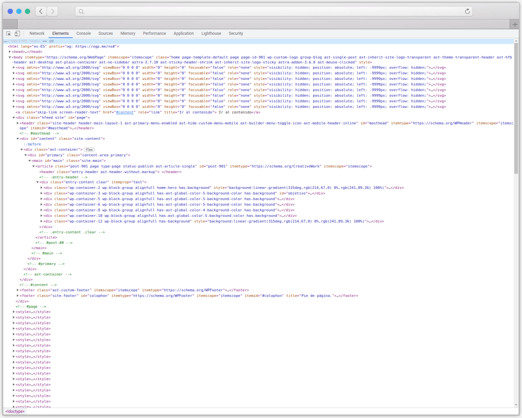
Does this markup feel right?

It’s from a fairly simple website built with the default experience the most widely used theme and the block editor provide.
In many ways it’s still better than the average WordPress install using some of the major actors in the page builders market, but, to me, it feels bloated and opinionated:
- Unneeded tags are getting printed.
- Additional stylesheets and scripts are requested.
- There are a lot of inline styles.
- The markup is filled up with unwanted classes.
- Each of this classes has its own associated style, which overrides the ones written on a site-specific style sheet since they are inlined and have greater specificity.
- The CSS is populated by variables, which are still unsupported by 3% of the traffic.
These are many things to grasp, and it’s just the website boilerplate.
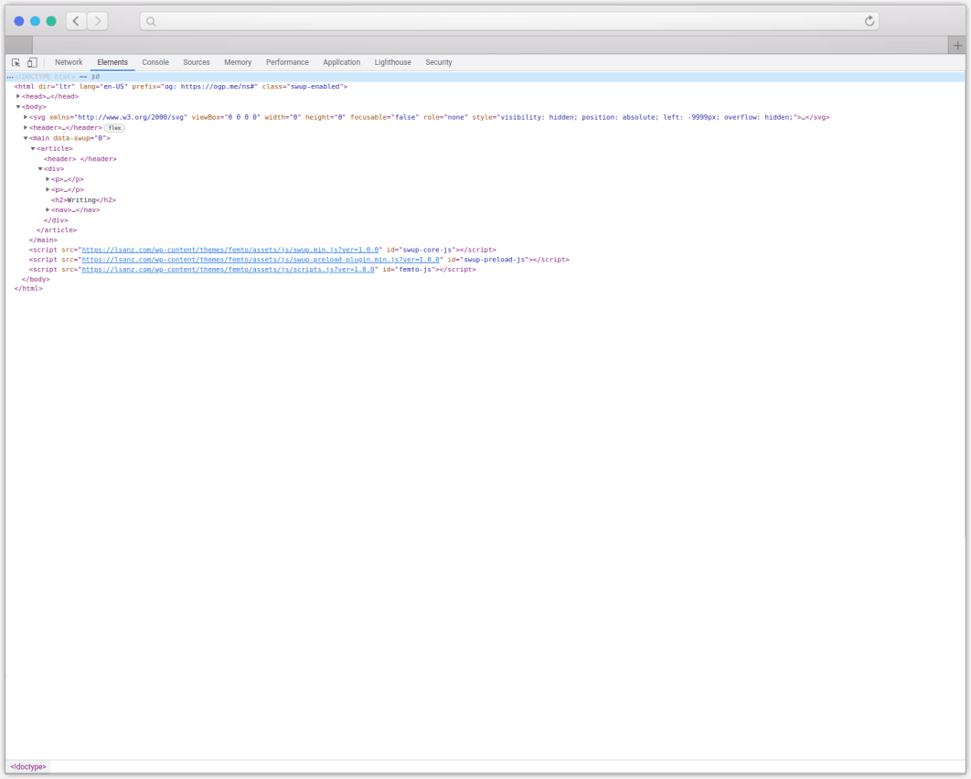
My approach is to dequeue the block editor default CSS and all the additional markup and requests added to the html source and load my own preprocessed style sheet with custom styles just for the blocks I need.
I also remove the ability to use the unsupported blocks via allowed_block_types_all or some of their features via block.json, so that the content edition team has a more consistent experience.
The resulting style sheet contains not just the block styles, but also the website UI, in a unique file request, usually under 40 KB.
During the last three years of several sites in production with this approach, I only had to perform two adjustments:
- The whole global styles implementation, which came out with WordPress 5.8, was not a good match for a tailored corporate custom theme, so I had it completely removed.
- The gallery block changed its html markup on WordPress 5.9, so the written CSS had to have its tags and classes updated.
So far, so good:

It achieves both goals:
- The front end is completely uncluttered and the markup control remains totally in the developer’s hands. The code is inmutable unless I edit the theme or change the content.
- It uses the block editor, which provides a faster and lighter back end experience when compared to other editors, and feels aligned with future WordPress releases.
It still doesn’t provide a fully featured experience of the editor, but this is the usual approach when it comes to corporate websites. Extra caution is always applied to avoid content editors from breaking the design, and the block editor is way too flexible to allow all of its layout options to be used.
Time will tell if the solution continues to be safe. It has worked well for me without having to invest much time on building complex solutions or relying on externally developed solutions.
The benefit has also been patent on site care, which required just minor attention twice in three years. In the end, it’s much easier to rewrite a bit of CSS for a block than to maintain a complex tool with dependencies affecting the site layouting technology.
Could things have been different?
Undoubtedly yes, there were technical ways to do things better. There always are, but overall the block editor and its integration onto the core are a pretty solid job.
I believe a more clear path for critical decision taking would have helped.
For example, the use of React on the editor was properly debated. It worked out quite well and it’s hardly discussed nowadays.
But their good, old CSS and html counterparts weren’t open to an in-depth analysis and both are suffering dearly at this very moment.
Opening every bit of the project to public discussion had a cost, delaying milestones at the beginning stages of the Gutenberg project. And it was decided to prioritize development speed to catch up with other market solutions.
In my opinion, the CSS implementation had the worst outcome. It’s a monolithic style sheet weighting almost 100 KB that packs all the blocks and all of their options, even if the website uses just a few, with several naming methodologies and different browser compatibility support on a per-block basis.
I don’t feel the chosen solution is working out well as a whole. And the way Site Editor is being integrated will mean more css injected into js via json files and then -again opinionatedly- converted to variables and printed as inline styles.
I have always had the certainty that the block editor could have been built to a more agile degree using a functional CSS methodology:
- The CSS file would have been much smaller than the current one.
- It would have been much easier to implement new features and blocks.
- Third-party blocks wouldn’t have to inject any more styling code since they could rely on inmutable, atomic classes. The cost of this would have been enormous at a global scale: today internet would be faster and its carbon footprint noticeable lower.
- With the use of a style sheet generator tool or plugin, it would have been a breeze to customize the appearance.
- Inline styles wouldn’t be needed at all.
- Themes and plugins, even if not block related, could reuse that stylesheet as their own, reducing http requests.
But it’s too late for such a change.
The situation is what it is, and it will take some time for this second phase to be over before theme development returns to a dead calm sea.
So, is WordPress on the right track?
At the end of the day, yes, I think that the direction WordPress is heading to makes sense.
The fact that it’s suboptimal for a spectrum of professional client work should not hold those changes back. If most websites and users benefit from it, as it’s the case, it pays off. And, for the moment, the ability to use custom solutions and opt-out from it is still feasible.
I still think that WordPress is the right tool for most corporate websites. Maybe just a little less than it was before.
 Luis Sanz Rodríguez